
Frustration. Surprising, but that's the feeling thousands of banking employees experience daily when working with outdated banking back-office systems. We're talking about banking, where mistakes literally cost money, clients, and reputation. Following the success of our article about banking back-office flaws, UXDA dared our team to create an innovative banking back-office design that would clear a path to a different service UI design approach.
All Core Banking UI Design of Back-Office Systems Must Become Modern
In the age of social media, we know for sure that facades can be faulty. Surprising or not, this applies to banking as well. Who would have thought that behind the tall glass buildings and the modern-looking mobile banking apps, there are core banking back-office systems that remind us of grey and soulless solutions created 20 years ago. It's unbelievable how much struggle these systems cause ─ starting from long-lasting employee training, unacceptable mistakes, overall stress level, poor productivity, awful client service, etc.
We believe there can be improvements made from the UX perspective, and we're enthusiastic about helping the financial institutions and employees who combat these banking back-office systems daily. And, let's not forget about the customers who are directly affected by the way a banking back-office system operates. A new approach would significantly increase the speed, accuracy and reliability of the financial institution.

And now we'd like to introduce you to six mind-altering core banking back-office design concepts created by UX architects and designers from the UXDA team. These designs were created to demonstrate banking back-office CAN and should be simple and pleasant to use.
Each of the unique designs is created according to specifics and requirements of varying types of banks. Some are more conventional and reserved while others dare to be trendy, creative and bright. Detailed descriptions are displayed below the images of designs.
The Light Down

Light, intuitive and user-friendly. That's what this design is all about. Just like a down, it's gracious, light and simple. At the same time, it's handy and pleasant for the banking employees to use as well as to look at.
Designer of this back office dashboard design concept Victoria describes her vision:
I was really excited about this challenge because it reminded me of my first working experience. I remember these '2000 and late' grey colors, extra-small, unreadable fonts and Excel-type lists with plenty of text. There were dozens of steps I had to take to make any action. I was constantly stressed out and frightened to forget something and fail. That's why I can truly step into banking employees’ shoes and understand how an 'anti-UX' system creates an inefficient work environment.
The effect of lightness and cleanness is reached by creating white spaces that have been refreshed with quiet colour accents and visual elements, such as attractive icons.
This is a solution that the banking employee can use effectively starting from his/her first workday rather than wasting months of time and energy studying tutorials and reading guidebooks.
This concept is designed for a medium-sized bank that serves different kinds of clients in a branch as well as by phone.
In the central part of the screen, an employee can see all information related to clients. On the right side panel, it's easy to access messages and notifications, view daily tasks, add new events and reminders to the calendar.
Further, this design is intuitive. All key information is located on one screen, so employees can easily navigate and quickly find exactly what they need. This kind of approach to core banking software design results in user satisfaction and comfort since their daily tasks aren't causing any frustration or stress.
The designer of this banking back office design concept created it with the goal to be so simple and understandable that even her grandma could learn it. And, we believe that's a great indicator to measure the usability of a service.
Simply Quiet

This banking back-office design concept is based on three key pillars - it's simple, clear and functional. It was created by deliberately sidestepping from trendy “dribbble-like” designs that can often be characterized by extra fancy, bright and redundant components.
In this modern financial dashboard design, emphasis is mainly put on a combination of stylish and classical, serious-looking interface that's complemented by well thought-out features.
Right at the top, a 'Smart Search' input is displayed. With this easy-to-spot search field, the banking employee can conveniently look up any kind of information needed. In designing this feature Mike has cleverly reduced overstuffing of the workplace that's common in traditional banking back-office systems. It's done by creating one search box instead of several separate ones in every block.
The whole screen is divided into three working blocks depending on the banking employee's preferences and the frequency of daily tasks. On the left side, the main menu is conveniently displayed with a clear view of the calendar and scheduled tasks, 'to do' lists and pending appointments.
The main working block is positioned in the center of the screen. The activity chart contains all the important information about the client's affairs. For the convenience of the employee, this can be easily sorted and filtered. It's simple and quick to navigate through the chart and switch between the tabs of activity status that are displayed above.
This kind of dashboard UI design and architecture is so simple and transparent that the employee is able to perform his/her daily tasks quickly and without any struggle. The end result benefits the clients as well because the speed of request processing is increased significantly.
'Client verification' is one of the most frequently used options among employees who serve clients daily. It's important for it to be easily and quickly accessible, as well as secure, because the client's personal data are being processed. Mike has stressed the importance of it by making the button stand out from the overall stillness. It was achieved by the use of bright amaranth¹ so as to stand out from UI's overall colour palette. This clever accent serves to capture the banking employee’s attention without being exaggerated, and it fits perfectly into the overall quiet and peaceful style of this banking back-office design.
Right under the button, there's a feature that allows the employee to easily mark 'favorite' clients. Simply noting a client's name it automatically pins to the top of the list, making it easily accessible.
This core banking software design is shaped by noticeable but quiet shading, complemented by selective colour accents, making it simple and light. The smart architecture and the use of colours create a clear overview of the workspace, providing the employee with a user-friendly and stress-relieving atmosphere. At the same time, catchy accents keep the employee alert enough to be quick and effective in response to tasks.
What can be better than a working tool that relieves employee's stress and assists in solving problems instead of creating them?
1- Amaranth is a reddish-rose colour that is a representation of the colour of the flower of the amaranth plant
Refreshing Breeze

This modern bank dashboard design is the opposite of common 'grey and soulless' back-office systems. It radiates lightness and freshness with an energetic touch of bending shapes popular in current design trends.
The interface has colour accents that evoke satisfactory emotions of clarity and understanding with a clear text indication and readability for the user.
Talking about this financial service design, the creator of it Arnold states:
This banking back office design was created with the following thoughts in mind: banking employees are human. They have emotions. Their minds are unconsciously reverberating with the objects they make contact with, be it physical or virtual. If the employees have to work with monolith-looking interfaces from late 90s daily, it will start to feel depressing over time, resulting in decreased efficiency on the job.
According to the visual aspect, a white background is used so that the other tones would stand out, creating a refreshing look. Vivid sky blue and turquoise are the main colours used throughout the design. The use of Vivid sky blue achieves an overall sense of trust and stability, whilst turquoise accents refresh the overall look. The combination of the two colours creates a visually pleasing overview while residing beside the textual and interactive content.
Pure Harmony

This is an intuitive and easy-to-use banking back-office interface design. What makes this service design UX exceptional is the feature of adjustability, adding a nice touch of personalisation and friendliness.
This 100% user-centred banking back-office design is intended for a bank that serves a large number of customers.
In the central part of the workspace, there's a spacious 'client affairs' block. All the most important functions have been harmoniously merged together creating one whole, complete section as opposed to common back-office systems that are based on fragmentation not a holistic structure. This is a smart and easy-to-perceive way to present a large amount of information. The banking employee can quickly and easily manage all of their daily tasks with no struggle at all.
Above the list of clients, there's a search field and an ability to filter the tasks by various parameters such as activity, date, status and customer. It's convenient for the banking employee, greatly increasing efficiency unlike traditional banking back-office systems that stress out the employees and waste their energy on entering several difficult number and letter combinations while simply trying to search for something.
On the right, there's a section of modular blocks like the daily schedule of the employee and frequently used action tabs. This is the best part of the financial dashboard design - the employee can become the architect of his/her own workspace. By simply dragging and dropping, it's possible to change the arrangement of these tabs and reduce or increase their size. In this way, the employee's are able to customize this block according to their current priorities.
This modern dashboard design is based on a neutral, light colour palette that has been refreshed with tiny bits of brightly coloured accents. The combination of quiet and vivid tones aligns this core banking design concept with current design trends. It's not only pleasant to look at and delightful to use but is also a great partner for the employee to help manage the daily tasks with ease.
Calm Hideaway

When it comes to this design, the key phrase is “no stress-zone.” The designer of this banking back office concept Anastasia had an interesting vision of this. She intended this design to be kind of a 'tribute' to the long-living back-office concept banking employees are so accustomed to. To avoid misunderstandings, it doesn't mean she tried to preserve the poor dashboard UX and other negative features of common back-office systems. Instead, she created a solution for a more wary financial institution that wanted to remain low key and was looking for rapid integration of innovations.
This design maintains a reserved tone with peaceful and relaxing shades of grey but is energized with a mild and joyful colour palette to prevent boredom.
The main central block provides a clear and unsophisticated view of client activities. The employee can easily and quickly switch between different categories of tasks by clicking on the tabs above the client list. And, here's another example of a great financial UX design - when the employee is switching between the tabs, only the information displayed in the middle is changing. The side panels remain static, enabling access to notifications, messages, personal data, current tasks and schedule.
This finance software design is super convenient because the employee has all of the most frequently used features right at hand, independent of switching between categories in the main block.
When it comes to visuals, every other row in the list has its own shade of grey. This was done intentionally not only because it looks attractive but because it allows quick scanning of the chart.
This is not the only case in which colour is used cleverly for relieving employee stress and fatigue. 'Colour coding' is used in the schedule to mark certain categories of tasks as well as in the main block to differentiate one client status from one another. And, again, it's not only about a delightful look. After a long day, the employee’s eyes are tired, and it's much easier to navigate if certain colours are already associated with specific events in the calendar or statuses in the affairs list.
Notifications and the 'Client verification' button have been denoted by the use of a turquoise colour. It stands out from the peaceful light grey background but is not offensive because it represents harmony and calm.
This is a reserved yet innovative and modern banking back-office design that is convenient and soothing for the user.
Wise Assistant

This core banking dashboard concept by UXDA's Art Director Andrew serves as a great example of how a skillfully crafted design can improve not only the emotional and visual aspects of a service but enhance the overall user experience of banking employees.
The goal of this financial dashboard design was to create a tool that assists and helps banking employees in their daily tasks - a banking back-office system that is enjoyable and pleasant to use, supportive and somewhat fun.
UXDA's Leading Designer Andrew noted:
In interfaces, an important detail is often missing. Designers tend to forget that these systems will be used daily by real people. So, my aim was to create an emotional design that's fully functional but also provides a sense of friendliness and companionship for the employee.
To achieve a feeling of positivity and feathery, light and clean colours are combined with bright accents. Colours and other design elements, such as thin contours and just the right contrast of fonts, allows the employees to navigate the page quickly and with ease, finding exactly what they need.
The financial service design is divided into three main segments. On the left, there's a calendar/schedule section. The current time and date stands out from the overall workspace with the use of a large font, making it easy for the employee to avoid punctuality mishaps.
Below the calendar/schedule section is the 'Upcoming tasks' block. It's clear and user-friendly and is not redundant. This prevents the employees from missing anything and allows them to stay on top of their schedule. As you can see, there's also a reminder to go out for lunch, letting the employees know that the workplace cares about their well-being.
Next comes the full calendar in which the employee can conveniently view tasks for the whole month as well as add new ones.
Now, to the central part of the screen. At the top, sections of messages, notifications, documents and activities linked to the team are displayed. This kind of positioning is easy to perceive and allows the employee to find and update the needed information as quickly as possible.
Below that, there's a clear and easy-to-understand 'Client affairs' block. Andrew has created enough space for it to be clear and pleasant to look at, efficiently bypassing the curse of overstuffing.
Above the client verification, the ‘Add a client,’ ‘Search’ and ‘Filter’ buttons are located.
Clients are highlighted in colour according to their status. Again, smart 'colour coding' is used to ease the navigation of the employee, even at the end of a long working day.
Another great feature is the option to add notes right at the client list. It's impossible and overwhelming to remember tons of information, but there might be some specific details of the client’s affairs that are important and need to be retrieved quickly. The notes solve this problem. This improves the level of personalisation and overall service because the client feels appreciated.
On the right, there is the key information about the employee, currency rates and other handy sections for quick access any time. The order and contents of these small blocks can be changed in the settings according to employee preferences.
Here's another detail that makes this core banking system design truly a 'friend' and assistant, not just a banking back-office system. There's a help icon located in the upper right corner. All the employee has to do is to drag and drop the help icon on the section that needs to be explained and he/she will get a description. It's a smart mechanism created by Andrew to help new employees get to know their tasks and start working efficiently as soon as possible. It also assists the more experienced employees to get quick help and descriptions of the functions that have been recently added to the system.

Conclusion
Every creative UXDA delivers is based on a mission to make the financial industry flourish. That's why all of these core banking back office designs strive to show - there's no reason to be ashamed of emotions in financial design. Actually, it's the opposite -
adding passion and spark to banking is the way to captivate the users and make them feel like this is a service designed by real people that truly understand them and care.
We believe, it's crucial to re-create the inner culture of banking, steering it towards a customer and employee centered approach. The team of UXDA truly hope this article inspired you to at least to look at back office system from a different angle.
At the end of this journey in a dimension of completely different back-office systems, we'd like to conclude with a question: what if we conducted an experiment and tested one of the back-office systems listed above versus a common one? We'd make the employees repeat the same task, fix the time and document their emotions and mistakes that were made. What would the results be like?
For more inspiration of shifting the mindset read our article: How to Succeed In The Digital Age: 10 Brutal Truths Every Bank Has to Admit.
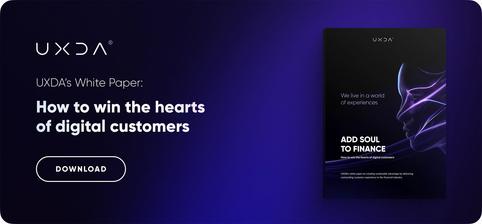
Get UXDA Research-Based White Paper "How to Win the Hearts of Digital Customers":
 If you want to create next-gen financial products to receive an exceptional competitive advantage in the digital age, contact us! With the power of financial UX design, we can help you turn your business into a beloved financial brand with a strong emotional connection with your clients, resulting in success, demand, and long-term customer loyalty.
- E-mail us at info@theuxda.com
- Chat with us in Whatsapp
- Send a direct message to UXDA's CEO Alex Kreger on Linkedin