
Why would anyone want to lower their standards and go back to using something that doesn’t provide the same value and experience? The truth is that some financial apps and services make us feel better and help us more easily solve our problems, while others do the total opposite─cause frustration, confusion and even stress. So, let's explore the financial psychology of users by looking into their minds, behaviours and main aspects of why certain products are disliked while others are desired.
Currently, in the world of finance, there is a growing number of banks and Fintech services trying to compete by offering various solutions to their users─rich with features, functions and innovations. At the same time, the expectations of the users are growing rapidly as well. Once the user has felt what it is like to utilise a great product, the same kind of quality will eventually be expected from other services.
What makes a great financial product? Is it something that has all the functionality that a user would need? Is it something that's highly innovative and packed with the latest design and banking technology trends? This does seem to be the mindset of some designers in the Fintech and banking industry.
While innovations rich in functionality and banking UI trends are something that greatly helps financial services improve their image and position in the market, at its core, what makes a product special is the ability to put the highest focus on the actual user. No matter how smart the financial product is, how visually appealing the interface is or how powerful the features are, one key element is still missing if it hasn't been created with human psychology in mind.
Financial psychology helps understand the relationship between humans and financial services
UX Designers see and say the word “user” a lot. Undeniably, is it a simple term with a meaning that is clear for almost everyone. However, behind this word, there is a lot more than most people can fully comprehend─that someone who will be taking their time and effort to use your product is a real person. This person has thoughts, emotions, feelings and situations that affect their mood, with so many psychological and physiological aspects that need to be taken into consideration when creating financial UX design.
In fact, to have a better vision and create a user centered design that will have a positive impact on their users, UX professionals should use proven psychology studies that strongly state facts about the way users perceive certain elements of the interface, their behaviours and reactions. Psychology plays a critical role in helping banks better understand and serve their customers, which is essential for the long-term success of any financial institution.
Psychology is important in banking for a number of reasons.
First, psychology can help banks understand and predict consumer behavior. By understanding how consumers think and make decisions, banks can design products and services that better meet their needs and preferences. This can help banks attract and retain customers, as well as increase customer satisfaction and loyalty.
Second, psychology can help banks improve their marketing and sales efforts. By applying principles of psychology, banks can create more effective marketing campaigns and sales strategies that are more likely to appeal to consumers and drive business.
Third, psychology can help banks improve their customer service. By understanding how consumers think and feel, banks can design customer service processes and practices that are more effective at addressing customer needs and concerns. This can help banks improve customer satisfaction and loyalty, as well as reduce customer churn.
It is not easy for people to deal with finances, often conjuring up negative emotions. In fact, some people are even terrified to access their digital bank to view their balance. The finance environment causes stress and even sleeping disturbances for 65% of Americans, as stated in a 2017 study by CreditCards.com.
Moreover, another survey from PricewaterhouseCoopers (PwC) claims that the group of people who report the most stress about finances are millennials, since 42% of them have student loans, and 79% state that “their student loans are having a moderate or significant impact on their ability to meet their other financial goals.
Due to the fact that finances are such a stress-provoking issue for most people, it is important to know what can be done to improve this situation. What are the key financial pain points for people, and how can they be addressed with the right financial products? How can we change the relationship between humans and finance and turn it into something pleasant?
How to use psychology to improve digital banking
A big step towards providing a positive financial experience entails not only offering cool product features and nicely-designed banking functions, but taking a deeper look into the ones who will be using the financial product as a part of their daily lives. The basis of this human-centered approach is the exploration and understanding of the human mind, psychology and mental habits.
Using this as the foundation for creating a pleasant and effective banking product design can and will create a serious improvement in how people perceive and use finances.
We know that technologies develop rapidly, and new solutions are introduced to us daily, but what doesn't change is the way we perceive the world, think, behave, make decisions and feel. Although undoubtedly affected by the times, these fundamental principles have been developing within us since the beginnings of human existence, and they remain generally the same.
Knowing that, I want to go through some of the key studies, proven facts and user researches that were conducted specifically for the exploration of the psychology of the human mind and understand how these rules apply to financial UX design.
1. Ensure UI consistency according to Jakob's Law
First introduced in the year 2000 by the world- renowned usability expert, Jakob Nielsen, the law states: “Users spend most of their time on other sites. This means that users prefer your site to work the same way as all the other sites they already know.” In essence, Jakob’s law correlates with studies exploring the learning curve and consistency: how we feel better if we face familiar paths, UI elements and scenarios, which reduces the learning curve of a new application.
For many people, the learning and understanding of finance is a tough task. If banking product design is created using unfamiliar approaches, different paths and uncommon element placements, the users’ cognitive load will increase, thereby exponentially increasing their learning curve.
The first experiments on the learning curve were described by the German psychologist, Hermann Ebbinghaus, in his 1885 book titled - Memory: A Contribution to Experimental Psychology. Since then, many other similar experiments have been conducted, and the results confirm a convincing fact that when people repeatedly perform the same task, they get better and faster at completing it. In fact, as stated in a 2009 article by J. Nielsen, people hate change.
An infographic by Toptal, demonstrating different laws of UX, including Jakob’s law
For instance, imagine logging into your online bank account with the goal of quickly paying your monthly utility bill. We’ve all been there, and it's not the most pleasant task. What we want at that point is to just be done with it and get out quickly. In situations like this, people love when the design provides them with a stress-free experience: familiar, intuitive content and immediately identifiable features.
More than nine out of ten millennials (95%) are owners of smartphones and use a wide variety of applications daily. Popular apps and social media platforms, such as WhatsApp, Instagram, Facebook and Messenger, are shaping the way people perceive the technologies and what they expect of their services. If you can send a message or a photo in just a few seconds, why shouldn't the same simplicity be achieved when conducting financial transactions? Now, in an effort to make their daily financial lives easier, some popular applications do implement payment options within their platforms, making financial transactions as easy as sending a message.
People like to make effortless, fast and easy transactions and perform them in well-known and previously-used environments. Now, the same kind of simplicity and user experience is highly expected from banking and Fintech applications.
2. Rely on mental models
You have probably been in a situation in which you have to use a new product and expect it to be complex. You might be thinking: This is new for me, and I probably will not know how to use it. But, unexpectedly, it turns out to be the total opposite─everything is simple and understandable, and you don't even need any additional help. However, what if that situation was different? You expect something to be understandable and familiar, but it turns to be completely different and just does not feel right. In this case, the product was created without taking your mental model into consideration. The smaller the difference between how you expect something to work and how it actually works, the more user friendly and intuitive the design is.
When we imagine digital banking interfaces, we often assume that they are difficult, boring and frustrating, and, unfortunately, quite often digital banking platforms do fall behind other modern services. If we compare digital banking to popular, highly-used and well thought-out services, banking interfaces often do not tend to result in pleasant and intuitive experiences for their users.
A 2018 survey from D3Banking showed that 68% of digital banking users in America are frustrated with their banking experience. In reality, this is one of the main results of not thinking about the mental models and overall experiences of digital banking users.
The foundation for the concept of mental models was first described in the 1943 book, The Nature of Exploration by Kenneth Craik, a Scottish psychologist and one of the earliest practitioners of cognitive science. In his book, the author states that the human mind creates “small-scale models of reality” and uses them to predict similar events in the future. In other words, a mental model is a representation of what a person has in mind, before using a new object for the first time. The model isn't based on known facts about the object, but rather on beliefs, expectations and assumptions, as well as the previous experiences and things the user has heard about it.
What model do your customers’ minds create when they think about opening and starting to use a new banking app or website? Do you know what they imagine and expect to see? If they're new visitors, they likely expect to see an option to open an account. If they're already registered users, first and foremost they expect to see the elements that play the biggest roles within their financial lives, e.g. account balance, recent transactions and the ability to make payments and receive money.
When designing an intuitive digital financial experience, it is a great challenge for designers to create a match between the users’ perceptions and the banking UI design. As finances can be generally confusing for many people, it is important to understand the mental models of your target audience by conducting research about them. The fewer mismatches there are between the mental models and actual interface design, the less time it will take for users to learn and understand it.
3. Provide explicit responsiveness
Some time ago, I was filling out a travel insurance application form on an internet banking platform. There were many input fields and options, and it seemed to take me longer than I expected. When I finally completed the form, I received the following feedback: “Your request has been received. Our operator will contact you shortly.” I was a bit confused by this response. While it is good that it informed me that I will be getting a response, it didn't say how long I would have to wait, if there is anything I could do while I wait and how exactly I would be getting the response, e.g., as a message in the banking platform, a phone call, an email?
I hoped to receive at least something in the next 30 minutes, but more than two hours had passed with no notification. Moreover, I had planned to go to the theater that day. What if I received a call while I was at the theater enjoying the performance? Needless to say, this lack of responsiveness caused frustration and a feeling that I did not have control over the situation, because I didn't know what to expect and when to expect it. As stated in his book on human cognitive psychology, Designing with the Mind in Mind, by Jeff Johnson,
Interactive system’s responsiveness—its ability to keep up with users, keep them informed about its status, and not make them wait unexpectedly—is the most important factor in determining user satisfaction.
This is a really strong point to keep in mind when designing a full and satisfying user experience, especially when dealing with the finance industry. Responsiveness affords us the ability to understand what is happening and what will happen, which creates a sense of control. A great example of receiving response on a requested credit is N26 Bank. The user can clearly see the information about the incoming credit as well as the expected arrival time.
When referring to users of digital banking, receiving constant feedback is highly important. When there is money involved, people do tend to become very sensitive and emotionally triggered. The users have their time requirements, and they expect the system to synchronize well with them. In fact, there has been much research done to better understand the connection between responsiveness, users’ satisfaction and ability to wait. Some of the most well known studies were conducted by Robert B. Miller in 1968, A.J. Thadhani in 1981 and Avi and Sara F. Rushinek in 1986, among others.
What all of these studies have in common is a confirmation that responsiveness is the most important factor, even more important than ease of use, in terms of user satisfaction. If banking interfaces cannot provide enough responsiveness for their highly-demanding users, they will feel frustrated and cause them to seek better alternatives that will fulfill their needs.
4. Focus on visual processing
Information, text and words are what's all around us daily, and every day we deal with reading at some level. Either it is the title of an article on a news page, an email we receive or information about a product at our banking website, we are used to perceiving the textual information around us. However, reading has not always come naturally to us. Moreover, the skills of reading and writing did not even exist around 3000 years BC. While the human brain evolved to naturally support the spoken language and to see nature's elements around us, writing became common long after the brain had already developed into its modern state.
When it comes to user centered design process in finance, it is essential to provide information so that the user will not only read it but, most importantly, understand it. Generally speaking, finances are based on information that needs to be communicated efficiently and concisely for its viewers, readers and users. That’s where UX (user experience) design plays a major role. There can be so much data on a banking website that the user can often get overwhelmed trying to process it all. Moreover, if the information is constructed poorly, filled with complicated terminology and not complemented with visual elements, users will have a hard time comprehending it.
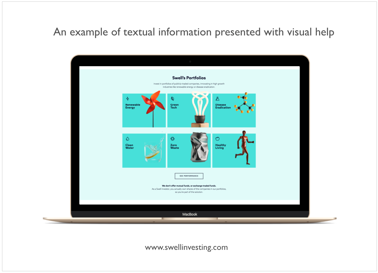
Everyone knows the famous English idiom, “A picture is worth a thousand words.” No truer words were ever spoken. People are much more responsive to pictures and visual information than to text. A research study conducted by 3M in 1997 concluded that visual images are processed 60,000 times faster than text. In fact, there is even a phenomenon called the "picture superiority effect" that demonstrates that images are more likely to be remembered than words. If we add icons to the text, it switches the irrational part of the user’s brain, which is responsible for emotions and feelings. An example of this is when you add emojis to a text to better visualize what you feel or think, when words cannot express it fully.
There are many rules that govern how the textual information can be presented in a more understandable, perceivable and even pleasurable manner. When designing a banking interface and selecting the right wording for your pages, sections and buttons, remember that your largest user groups are not banking professionals or experts. They don't want to see complicated financial terminology but, rather short and sweet, straightforward information, complemented by representatively relevant images.
It is important to apply hierarchy when structuring the financial information so users will have a much easier time understanding the data about their financial situation. If the information has been correctly prioritized and spaced out by putting accents on the details, users will have a much more pleasant experience.
Another rule to follow when displaying information for digital banking users is the Miller's Magical Number 7 (plus or minus two), designed in 1956 by American psychologist, George Miller. It represents the maximum pieces of information: text, images, options and other elements that the human brain can directly distinguish. Therefore, users will have a clearer understanding of the financial information when it is divided into chunks, lists and bullet points.
5. Organise UI elements according to Gestalt Psychology
In this dynamically growing technological world, designers are working hard to create visually- pleasing banking solutions to impress their audiences and even win prestigious design awards. The users do love to see beautifully-made, simple and easily perceivable financial designs. A 2012 study by Google proved that people tend to decide if they think a website is visually pleasing within 1/50th - 1/20th of a second. Another fact coming from this research is that “the more visually complex a website was, the lower is its' visual appeal.”
Moreover, a 2002 article by K. Karvonen explains in depth the idea of how the beauty of a website also affects the feeling of online trust, which I will focus on in more the final paragraph of this article.
But, what makes us feel the simplicity, visual appeal and sense of harmony in certain types of banking apps and websites? The truth lies in understanding our mind and how we perceive the visual elements around us. Banking design language can be taken to the next level by using well-researched and proven principles of human psychology and perception. If people detect a lack of organization, simplicity and harmony within the banking product design, there’s a good chance they will also struggle when dealing with their finances.
Gestalt psychology, a movement initiated by a group of German psychologists back in the 1920s', looked for the understanding of how people's minds perceive whole shapes and objects rather than disconnected elements. The German word “Gestalt” means “shape” or “figure,” and the main points of Gestalt psychology are described as Gestalt principles.
To better understand and learn the Gestalt principles, I suggest these books that greatly explain the main idea and give many wonderfully practical examples: Don’t Make Me Think by Steve Krug, 100 Things Every Designer Needs to Know About People by Susan Weinschenk and Principles of Gestalt Psychology by Kurt Koffka.
Visual design and human psychology are closely linked and strongly influence one another. If the banking interface is visually pleasing, harmonized and organized, it will create similar feelings in its user. Moreover, the financial success of your user highly correlates to the banking interface and the organizational system that it portrays. By using the right accents, symmetry, hierarchy and thinking into the composition of elements, the users will be able to focus on what is important and make better financial decisions, investments and savings for their future, thereby creating more wealth.
When we really think about it, the sense of visual appeal, stability and order that our minds seek really go beyond just beautiful design elements. It helps users sort out complex, emotional thoughts about finances and brings about a positive connection between relationships of humans and finance.
6. Avoid the paradox of choice
When creating a banking product design, often the designers want to include it all. “Our product has so many great options and how can you not display that to the users? They will appreciate our service, because it has more cool stuff than our competitors, right?” Well, not quite. Users think they want all of the options and possibilities in the world, until they get them. When faced with too many choices, they will get stuck and can often end up becoming confused, frustrated and ready to leave. You might think that by giving users endless options to choose from will help, but, in reality it increases the cognitive load or “excessive thinking.”
The theory of Hick's Law, proven by behavioural studies in 2000 and even confirmed by FMRI studies of brain research in 2015, describes this phenomenon in a simple way: the more choices users are given, the longer it will take them to make a decision. This might seem like an obvious and logical statement, but quite often it is forgotten. Hick’s Law also correlates with the Paradox of Choice by Barry Schwartz, who states:
More choice leads to more stress and reduced levels of customer satisfaction.
As scientists have researched, too many options to choose from creates visual noise. When users have to pick between two options, the decision can be made easily, but when there are multiple choices, the human brain gets distracted by the noise, which often results in making irrational decisions. This leads to a phenomenon called the “paradox of choice.”
In a nutshell, the paradox of choice can be described by an example of the many decisions your user makes on a banking platform: Which banking product should I use? Which payment method is the fastest and safest? In which mutual funds should I invest my money? Now let's imagine your banking platform and how your user is faced with making a decision with only two possible outcomes. On average, users will spend 50% of their time analysing each of the outcomes and looking for the best and one with the most benefits. However, by adding more choices, this percentage starts to decrease and results in fewer odds of making a successful and logical choice.
It is not an easy task to create the perfect balance of simplicity and minimization without damaging the functionality. Banking UX/UI designers should spend a lot of time getting to know the behavioural patterns of their users - how do users think, make decisions and if these decisions have rational or emotional backgrounds.
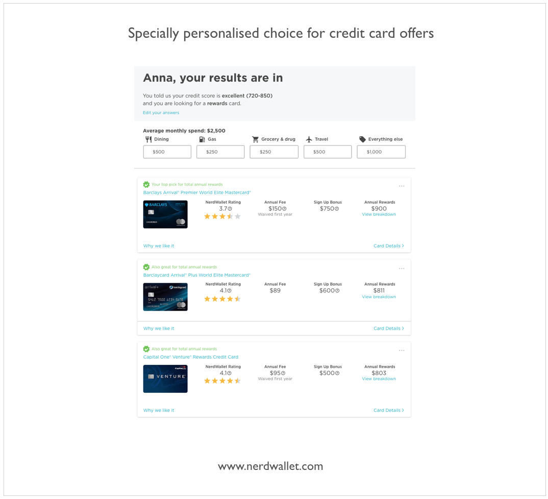
By understanding users’ goals and expectations in each function in the platform, we can determine the most important, top-priority features that should be included in the application at the right time and right place. Offering fewer, but more meaningful, relevant and personalized options will deliver an effortless and simpler user experience. A practice by Nerdwallet: user is presented with only three personalised recommendations when choosing a credit card based on the user’s data, needs and goals.
7. Encourage exploration by reducing fear of mistakes
Often, people are afraid to make mistakes, and the word “error” itself sparks a fear in people’s minds. Moreover, in activities in which there is financial involvement, people are especially frightened, because sometimes a single mistake can cost us precious time, a change in mood and, of course, money. We don't want to make the wrong decisions, choose a disadvantageous offer, press the wrong button and experience bad consequences. As finances can be a stress-provoking subject for many, it is important to understand that people tend to make more mistakes when dealing with stress. The “Yerkes-Dodson Law,” originally developed in 1908, states that “Too much stress degrades performance” and can often lead to users experiencing errors.
A well-designed banking platform is created in such a way that it is hard to make mistakes. As the saying goes, “The best error message is no error message.” It can be achieved if the whole organisation and architecture is constructed in a way in which it leads users to only successful outcomes, avoiding the possibility of making mistakes. However, if a mistake does happen, having a clear message about it and an easy way to recover or undo the action will make the user feel in control, which is something designers of banking platforms should strive to do.
There is a story about a friend of mine who had used a very outdated digital bank for the last 10 years and had never tried anything else. She often complained that the interface of this digital bank was hard to understand and often did not make any sense. Simple tasks, such as sending money and even just logging in, required too much effort and often lead to mistakes. I told her about a Fintech app that I personally use, and suggested she try it out. It wasn't easy to convince her, but eventually she downloaded the app and started using it. After some time, I was surprised to hear that she had trying out new products and offers that this app had, which she had not been confident enough to try in her old digital bank. Why did this happen?
A great advantage of well-designed banking platforms is that they encourage exploration. Users who are not afraid of doing something wrong will have a tendency to try out more that the platform offers. If we think about the user─if there is a banking platform on which the user constantly experiences errors, alerts and mistakes─what are the chances that he or she will want to try out other features that this banking platform offers? As stated in the aforementioned book, Designing with the Mind in Mind,
People who are anxious and afraid of making mistakes will tend to stick to familiar, safe paths and functions. When exploration is discouraged and anxiety is high, learning is severely hampered.
When a banking platform is designed in a way that the user is not afraid to make mistakes, then users start to explore it. One of the 10 Usability Heuristics for User Interface Design, coming from Jakob Nielsen in 1995, states: “Help users recognize, diagnose and recover from errors.” Even if mistakes do happen, users should not be blamed, but instead be given a clear explanation of what has happened, an explanation of the mistake, why it has happened and what can be done to correct it. In addition, this information should be written in a simple, plain and easily understandable language, one that your users are used to hearing and speaking.
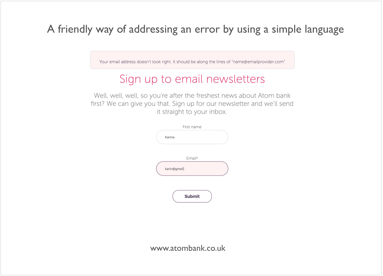
An example of a friendly error message comes from the Atom Bank. In the figure below, the user has entered an incorrect email address. This type of language will be more likely to reduce the tension as opposed to saying something like, “Error! Wrong format for email!”
8. Help users to reach their goals
People are always creating and following various personal goals. Remember the last time you opened your digital bank account. A good chance is that you did it because of a specific goal you had in mind. It could be a small goal such as sending money for your colleague in order to pay for the lunch that was ordered at your workplace, or creating a template for a telecommunications bill payment to facilitate future transactions. There can also be bigger goals that users have in mind in terms of their finances. They can use their banking platform in order to achieve something more significant in their lives, for example, a goal to purchase a new car or save up for the first payment of a new home or even achieve more financial stability and gain more wealth.
When creating the digital financial services design, often banks tend to focus on their business goals and forget to look deeper into the minds of people who will use the platform for achieving different goals. Following are questions a designer should ask: What are the users looking for? What are they trying to accomplish? Does my banking platform help them accomplish their goals? How easy and pleasant it is to do it?
In many situations in life, when people have a goal set in their minds, they will filter their perception and only focus on that goal, disregarding the rest of their surrounding environment. A great example to illustrate this idea is called the “cocktail party effect”, originally described by the British scientist, Colin Cherry, in the early 1950s. This effect describes the human brain's ability to focus its attention on the voice of a single speaker while filtering out the rest of the chatter that surrounds it, as often occurs at large parties─hence, the cocktail party effect. However, we can also become easily distracted from a conversation. For example, when we hear someone mention our name, we often lose the focus of our current discussion.
When designing a digital financial solution, it is vital to understand the main user goals and what they will be focusing on the most, how to address these goals and not distract the users from them. Try imagining how your users will feel if they are experiencing distractions, lose track of the task they are trying to accomplish and not reach their goal as quickly and easily as they expect? Such dissatisfaction will lead to unpleasant user emotions, and they might feel like other tasks on this platform will be similarly hard to manage.
When we think about a banking product interface, we can imagine it as a whole structure, consisting of multiple touchpoints with which the user is interacting. For example, one of the touchpoints is when users check their bank account balances, with a clear goal in mind to understand their financial situation and see how much total money they have.
In each of these touchpoints, users might have a different goal. UX architects and designers’ roles is to ensure that the information in each touchpoint is available and presented through clear and simple bank design language. The users who focus their attention on a specific task will look for consistency within the whole banking product. That way, they can easily spot and recognize patterns and familiar elements that will lead them to reach their goals more effectively.
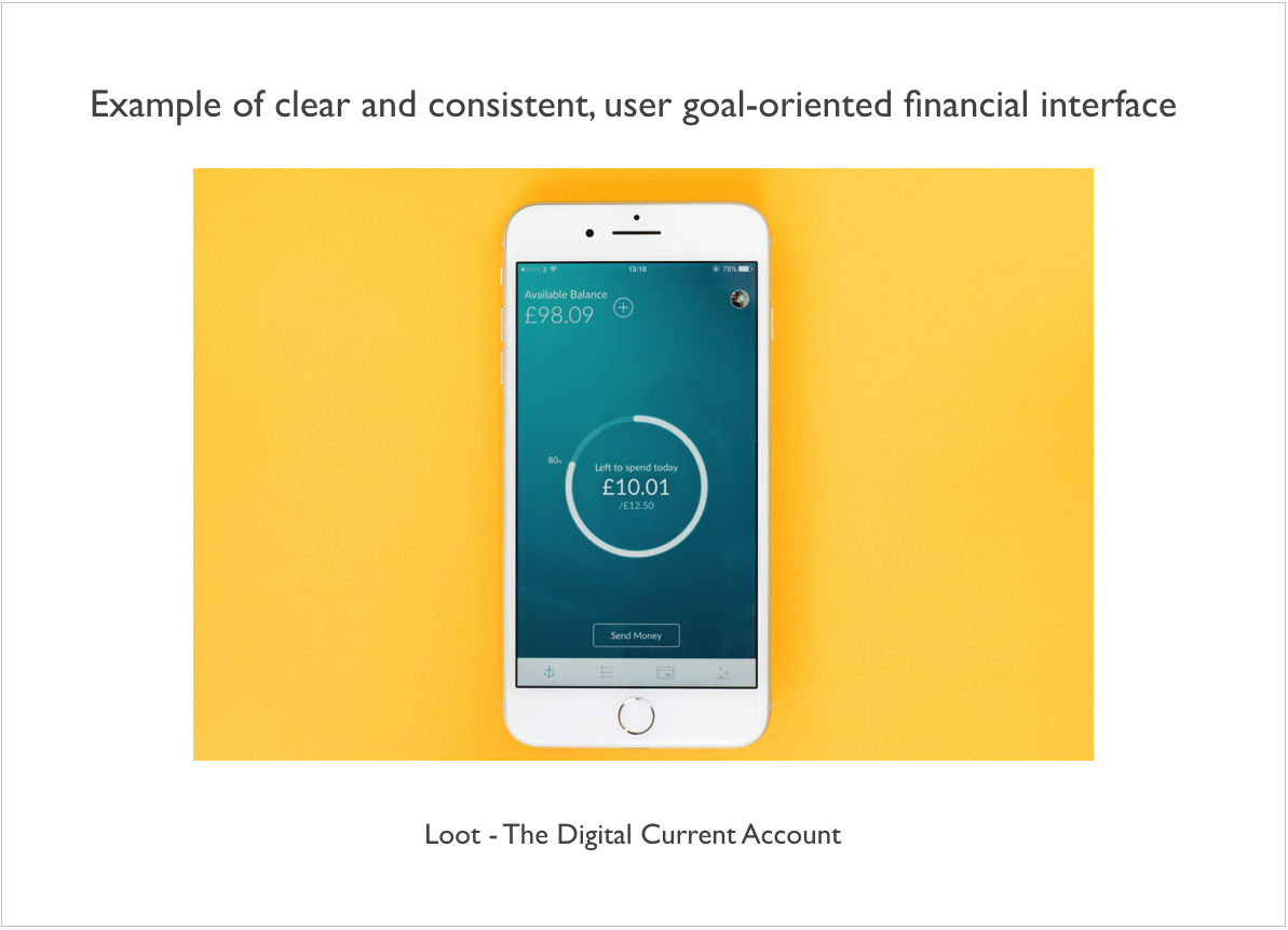
A neobank named “Loot” helps people to manage their money by offering a clear and consistent, goal-oriented interface by eliminating distractions and having personalized, straightforward features.
There have been multiple studies documented in the “Information architecture for the world wide web” by Rosenfeld L, Morville P. in 1998 and “The art & science of web design” by Veen J. in 2000. They confirm the fact that the information-seeking time can be reduced, and search accuracy can be improved, by organizing the web page layout in such a way as to display a clear hierarchical structure of information.
When we learn the users’ goals, we can also analyse the areas of the banking product that should be accented to grab the users’ attention, and which, on the contrary, should be toned down, in order to not cause a distraction from the users’ goal. If a financial interface is designed in a way that it helps its users to reach their goals successfully, the users will be pleased and appreciate the positive experience and effort that had been made when designing the banking product.
9. Motivate users to become better
Do you know if your banking interface motivates users to make good financial decisions? Do the users feel appreciated, cared about and rewarded? A useful concept of human psychology for looking at what creates a certain human behaviour is B.J. Fogg’s behavior model, introduced in 2009 by behaviour scientist and author, B.J. Fogg. The main idea behind it is that, for a specific behaviour to occur, three elements have to be present at the same time: motivation, ability and triggers.
The model assumes that a behaviour is most likely to happen when a person feels sufficiently motivated and is able to perform the behaviour. This principle can also be applied to banking, when designing a banking interface that motivates, triggers and provides the ability for its users to achieve their financial goals.
There is a study, based on more than 10,000 extensive interviews with millennials, called “The Millennial Disruption Index.” This research, initiated in 2013 and conducted for three years, revealed many key findings about what millennials actually think about banking and what their expectations are for the future of the financial industry. More than half of the respondents (53%) did not think that their bank offered them anything unique. The vast majority of respondents (71%) claimed that they would rather visit a dentist than listen to what banks are saying. These facts demonstrate why there are such strong and rather harsh opinions when it comes to banking.
What if banking UI design had the ability to result in totally opposite feelings? What if people could feel good and motivated when visiting their digital banking product? What if banking could motivate people to be more diligent with their finances? I believe that can bring a great, positive impact within people’s financial lives and their relationships with finance.
The key here is to understand how to bring a great, positive and enjoyable banking user experience that would make people feel motivated and have positive emotions, and how that could be applied when designing the future of banking.
A study by The Medallia in 2015 revealed that 93% of respondents claimed that a positive experience starts by ensuring that the basics are right, such as the security of personal information, transaction efficiency and effective problem solving. However, a great amount of people (65%) reported a demand for innovation, novelty and experimentation within their banking platform.
It is no secret that people seek fun experiences that excite them and bring them positivity and joy. A great approach used by some banks and Fintech companies is to use principles of gamification within their services. The main idea behind it is to seek understanding about people's motivations, how they want to be rewarded and create a human-centred design, which is optimised for human feelings. What makes people want to stay loyal to the product─whether it be games or banking? As stated in a 2017 article "The Gamification Effect: Using Fun to Build Financial Security" by Commonwealth,
Well-designed games and gamified financial tools can improve engagement and motivation, reduce stress, build confidence, and promote real-world action taking.
People are always looking for advantages and will be more motivated to use a banking product if it provides a benefit for them. They will use your product if they trust it, if it looks and feels appealing and if the product improves their experience in some way. Rather than focusing on “Here's what our product can do,” think about "Here's what people can do with our product, here's what people can accomplish and gain with using our product, here's how people can achieve the things they want with our product.”
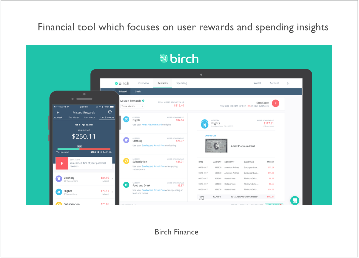
As stated by Samuel Hulick, a UX designer and author of the site “useronboard.com”: People don’t buy products; they buy better versions of themselves. Just like we use a calendar to improve our time management and a map to be better at navigating, people use banks to improve their financial management. The importance lies in banks realizing that and actually motivating people to become more financially savvy. A financial tool, “Birch Finance,” offers a simplified reward program and motivates its users by providing financial insights. There is a story by Business Insider about a millennial who gained a positive insight into her financial life by using this service.
Banks know a lot of information about us─our spending, our income, our financial behaviour and actions. This data can be used in a positive way to reinforce a motivating activity. It is important to present this data well, in the right time and place, by providing a motivating vision for the people of what they can become and achieve by using the banking product. Those banks and Fintech companies that care if their customers actually become a better version of themselves and that empathize with their clients will be much more appreciated and loved by their customers.
10. Build trust through digital experience
Trust is the fundamental factor of any relationship; without it, a healthy connection cannot exist. In our daily lives, we deal with trust all the time. Before going to sleep, we set an alarm and trust it to wake us up in the morning. When we go to work, we trust either the public transportation, a taxi driver or our car to deliver us to our destination. If there's no trust, we cannot rely on each other, and it is important to feel that someone has our back. The same principle can be applied when we talk about our relationship with finances.
It is highly critical for us to feel trust, especially when interacting with sensitive, personal matters, and one of the most sensitive tasks that a person performs online is digital banking. People share so much about themselves with their banks, starting from their personal information, right through to their private transactions and desired wishes and goals when opening a savings account. This relationship relies on trust, and is something that cannot be easily achieved. To put it simply, if people don't trust it, they won't use it.
Why do people feel sensitive when it comes to trusting someone? We can look for answers back in the prehistoric times, when our ancestors interacted within groups of tribe members. The trust in the groups was critical and helped them to survive. It was vital to know if the members of your group were plotting against you or if their intentions were sincere. As stated in the research of human brain studies by cognitive anthropologist, P. Boyer, and and Professor of Psychology, A. Norenzayan, our brain is a powerful mechanism, seeks hidden, complex causes.
Other studies on evolutionary psychology and cognitive biases, coming from physician and evolutionary biologist, R. Nesse, and Ph.D. Professor, Martie G. Haselton, confirm that the human mind works almost like smoke detector, alarming us whenever we feel any possible threats in our surrounding environment.
In the world of banking, we often hear encouraging words about having peace of mind, feeling secure and trusting our banks. But, what exactly makes us trust one particular financial service? Is it a conservative, official look? Information clarity? A 2001 study on users’ trust in cyberspace by expert in software development, Dr. P. Nikander, and expert in human-computer interaction, K. Karvonen, found:
Quality of design to be highly among the features which enhance the feeling of trust in users when doing transactions online.
It is actually quite surprising that such a rational matter as people giving their trust to a certain service highly relates to something so emotional as aesthetics and beauty of design. When a person visits a brand new banking or Fintech platform, their first impressions are critical, as the determination of whether the website can be trusted or not literally happens at first glance.
A study coming from B.J. Fogg in 2001 was conducted on “Web credibility.” In this research, 2,440 people participated in viewing professionally-designed websites and gave great insights on people's perception of evaluating trustworthiness. The results of the study concluded that professionally-made design elements and features are more important than its contents.
Once the banking interface is created with an ease of use, the page layout is well constructed, graphics and readability are carefully created by focusing on principles of human psychology, then trust is more likely to be established, and the visitors can be inspired to interact with the site more frequently. Other important factors, such as customer care, demonstration of service and user guidance, also play a huge role in building trust. Therefore, when designing a financial product, great focus should be placed on all of these elements.
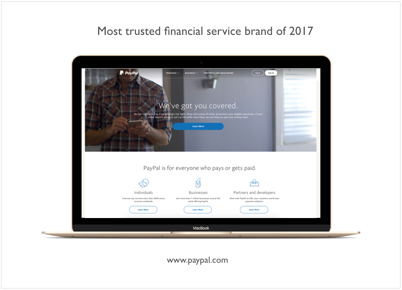
An example that greatly combines all of these elements can be seen in the financial service PayPal, which has been announced by Landor to be the most trusted financial service of 2017.
As the task of earning the trust of banking customers is not the easiest, designers should put the biggest focus on offering a banking platform that is uniquely made for them. Customers need to have the feeling that their digital banking design and overall experience is created by listening to them, understanding them and addressing their pain points. Once that is achieved, people will appreciate their banks and develop a trusting bond and relationship with them.
Conclusion - The Way to Understand Your Users
We live in times in which digital banking has the potential to be so much more than it has been for the past few decades─a lot more than just tediously displayed data, confusing navigation and information overload, presented in a way that causes stress and anxiety.
In order to create a customer-centred design in finance that will be enjoyed and appreciated by its users, it is all about understanding and empathy. Designers need to understand the ways users perceive the world. The users expect their banking solution to know and understand them, care about them and reward them. To create a great digital banking design requires an understanding of people’s experiences, emotions and thoughts that they will experience as they interact with your product.
Designers need to have a mindset of understanding what their users will enjoy and also what will they dislike and even hate. Not all creators of digital banking solutions will have the ability to study human psychology, but just by learning about the concepts mentioned above, we can already clearly see how big an impact it has when creating a digital banking interface.
The finance industry is so powerful, influential and is such an essential part of people's lives that there is no place in it for solutions that are not based on human psychology and centricity. When a digital banking solution is launched and used by millions of people, it is critical to create a meaningful impact in the form of a positive and delightful financial experience.
Get UXDA Research-Based White Paper "How to Win the Hearts of Digital Customers":
 If you want to create next-gen financial products to receive an exceptional competitive advantage in the digital age, contact us! With the power of financial UX design, we can help you turn your business into a beloved financial brand with a strong emotional connection with your clients, resulting in success, demand, and long-term customer loyalty.
- E-mail us at info@theuxda.com
- Chat with us in Whatsapp
- Send a direct message to UXDA's CEO Alex Kreger on Linkedin